Rad Trails has been through quite a journey of transformation ever since the project was initiated over a year ago. Originally the project was really nothing more than an experiment in how to generate a dynamic physics world from a bezier path.
Over time it headed in many different directions, and branched out into quite a few separate projects, before settling into what I now call Rad Trails – A dirt bike physics game with a clear identity.
I have gone through the git log for the project and tried to summarize some of the key states during the projects lifetime.
The initial commit
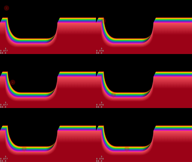
Date: Sun Jun 12 22:15:44 2016 +0200
Message: initial commit
The initial commit, dating back to june 2017, is perhaps the first time the project even slightly resembles its current state. It’s definitely the first time the project has a clear heading, which is aptly marked by initiating version control.
In this state, the project was little more than a sandbox for playing with different game- and physics engines. It was a playground for trying out different techniques for generating colorful graphics and cool effects, while using as few sprites and graphical resources as possible.
It’s funny; I had completely forgotten about this state of the project until I checked out the initial commit and compiled it today.
A skateboard game
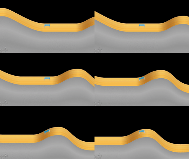
Date: Sat Jun 25 10:11:27 2016 +0200
Message: Skateboard implementation.
That’s right – the first title of Rad Trails was actually Rad Skate. At this point in the project I had focused a lot on developing a way of working with simplistic 2.5D depth by using 2D graphics and layered sprites.
I spent a lot of energy polishing minor details. If you look closely you’ll notice how the skateboard deck changes its luminosity to match the shade of the ground when going up hill. This was a detail that I added to simulate a common light source.
In retrospect it was to early in the process to focus on that kind of level of detail.
The missing link
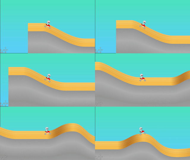
Date: Sat Dec 31 16:07:52 2016 +0100
Message:
 - Set up proper motors.
 - Working shocks - woohoo :)
Killing the skateboard concept was more of a mental leap in the development of Rad Trails. The skateboard idea was always very close to my heart but it made it very difficult to highlight the physics engine in the way that I wanted.
In the end I came to the conclusion that there was to many obstacles in using a layered sprite technique to create depth in combination with a realistic 2D physics simulation.
Neon visuals
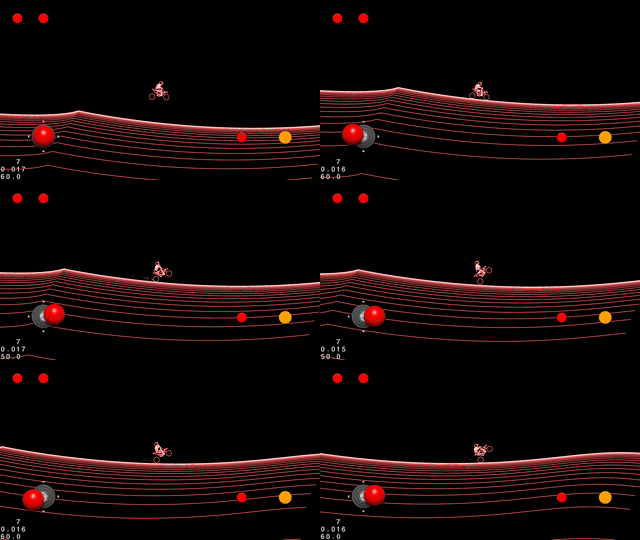
Date: Mon Apr 3 18:43:47 2017 +0200
Message: Added particles.
I decided to put more focus into finding the right aesthetics for the game, and to really focus on creating solid physics for the main player vehicle.
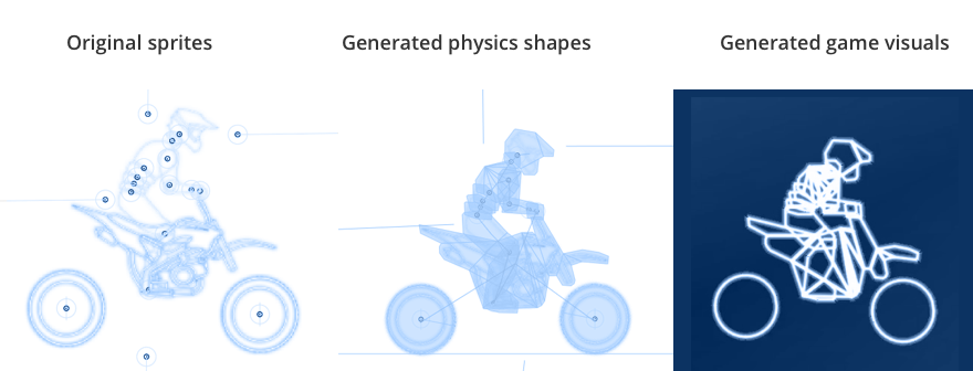
I experimented with using better sprites for the character. Using Level Helper I finally developed a technique to generate lines along a sprites physics shape, which turned out really neat.
Depth map generated map
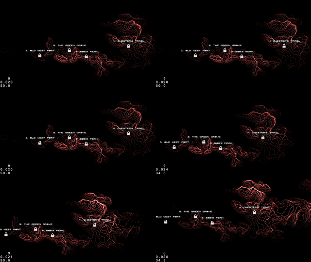
  Date: Mon Apr 17 09:19:57 2017 +0200
  Message: Elevation map.
I really wanted to highlight the world where the game takes place in a cool way. I found inspiration in old topographical maps but I wanted the aesthetics to be reminiscent of graphics in old monochromic computer interfaces.
Using QGIS I found a way to generate elevation line data from a terrain depth map image. Parsing the QGIS data and generating lines along the vector paths, I managed to create an effect that was pretty close to my initial vision.
Colors
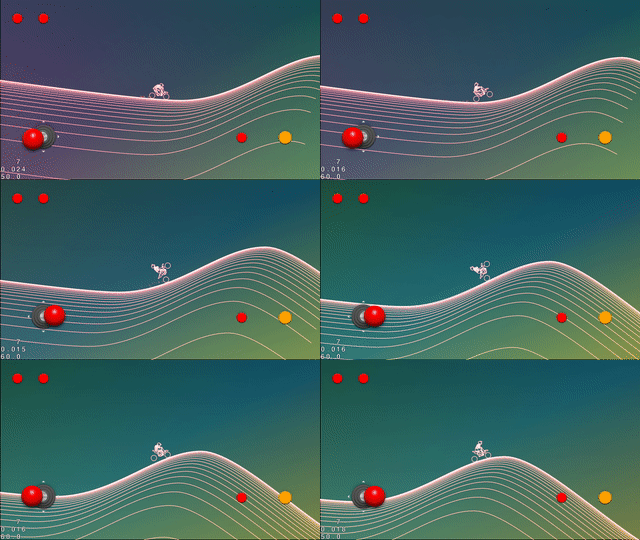
  Date: Sun May 14 17:27:51 2017 +0200
  Message: Colorful background..
I needed to visualize motion of the bike even when there was no graphical context to indicate motion. I.e when the bike is so far up in the air that the ground couldn’t act as a visual reference point.
By using gradient backgrounds fading between different colors, I managed to capture a subtle sense of motion without adding more graphical elements to the game. As a bonus – it kind of looks awesome. It really went on to become central component in the aesthetics of the game.
Leaderboards and multiplayer functionality
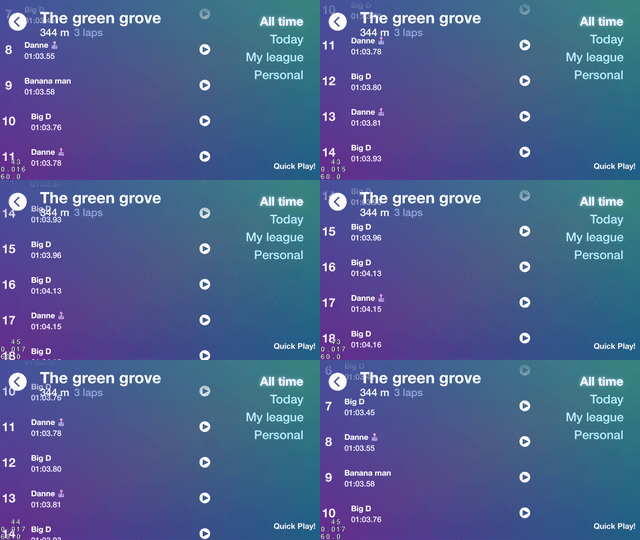
  Date: Sun Jun 18 21:07:40 2017 +0200
  Message: Set up basic detail page and prepared leaderboard table view.
The game deserved to have a solid online leaderboard. After some research I decided to implement leaderboards powered by Googles service Firebase. In the process I moved the level data online so that it would be easier to expand the game dynamically. Using the Firebase’s Realtime Database the game is still playable offline and syncs any changes automatically once the user reconnects.
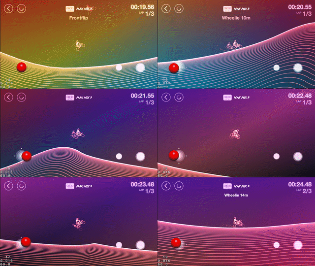
In this stage I also realized that it would be relatively easy to implement multiplayer functionality, so I went for it. I wanted the competitive aspect that is so addictive in similar types of games. As a result I needed a way to record the players movements and change the physics engine to be completely deterministic.
Reactions
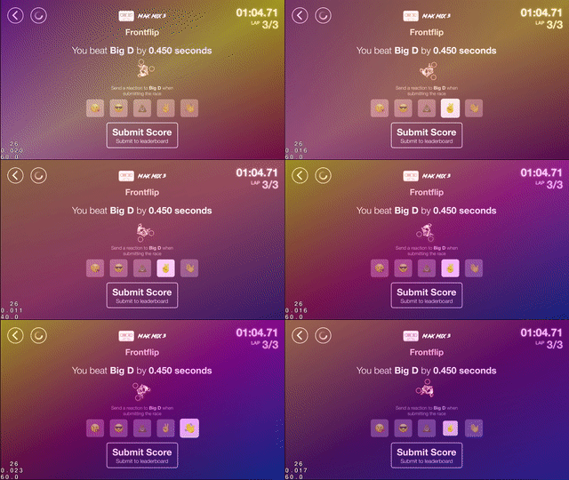
  Date: Sun Aug 20 22:10:09 2017 +0200
  Message: Basic reaction submission.
I wanted to add at least some way for users to interact with each other. I decided to add a simple, reaction based, bragging system that’s activated when beating another players score. Although this interaction is still pretty much one-way I think it adds an element of fun to the competitive aspect of the game.
Although I’m open to explore other ways of user communication in the future, I still want to preserve the philosophical origin of Rad Trails; Try to create as much playable value by using as little as possible, and avoid creating unnecessary complexity.
Trick feedback
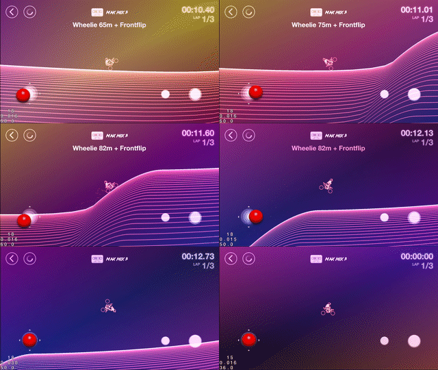
Date: Sat Sep 16 15:06:58 2017 +0200
Message: Sneaking in text effects for tricks.
One of the latest additions to the game was the text effects for highlighting when players succeed in preforming a trick. It’s a purely visual effect for now and doesn’t add anything other than a visual reward.
Text animations was something that I had thought a lot about during the process of developing the game. Initially I wanted the text animations to be more prominent, and full of juicy effects, but I had to tone them down to avoid causing too much of a distraction and because I felt it started to deviate from the original design philosophy of Rad Trails.
So there it is, we’re all up to speed on the development history and evolution of Rad Trails.
I guess this post is mostly a way for myself to take a step back and reflect on how the project has evolved. This is especially important for me right now as I’m nearing the final hurdles of actually completing and publishing this game.
While creating this overview of Rad Trails’ evolution, I have realized how much of its original state that I have forgotten during the process. I also think that writing this post may have helped me decide on which areas to focus on when proceeding with the project.
I guess the most important learning for me during this project has been that it’s often the best thing to explore another solution when you feel like you’re not making any progress. Be brave and kill your darlings. I was very fond of a lot of the original aspects of the game, for example; the 2.5D depth and the skateboard. I will never regret going in a different direction.
Consider the feasibility of applying an aesthetic, game play mechanic, or technology that you’re working with, to the rest of your unfinished game. Opt for going the easier, more feasible routes when your standing at the crossroads. I wish I had done so a lot earlier in a lot of cases in this project.