Just published a new version of Rad Trails on TestFlight. Checkout the latest improvements.
New title screen animation
Added a title screen that animations on app start.

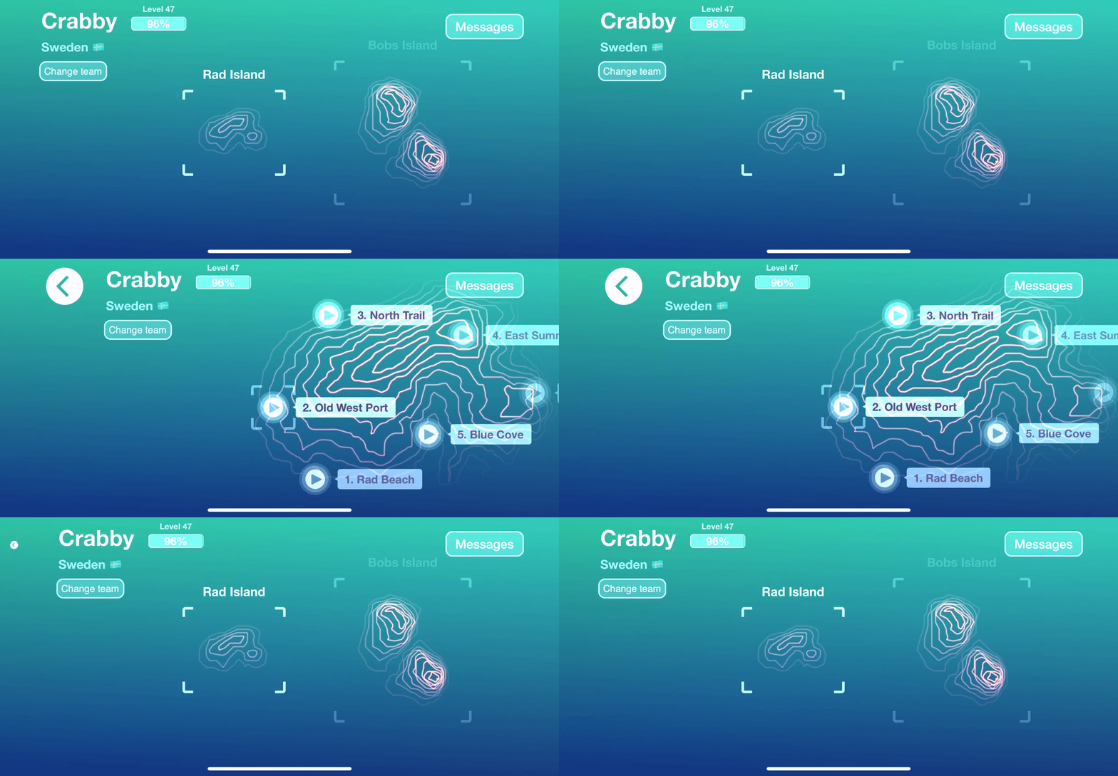
New track selection
I have been working on the final design of the track selection screen.
To combat usability- and performance issues I decided to break down track selection into several different ‘islands’. Topographical map renderings is now done using smaller individual depth maps to improve performance and give a better navigation flow for the user.

New levels
I’ve designed the first stage of the game to include some new simpler levels, to give users a better chance to learn the controls.
At launch there are 5 new levels and I’ve reordered the remaining levels to better match their degree of difficulty.
I removed some of the old levels that didn’t make the cut. Some of them felt to boring or disruptive when racing. I try to design levels so that it’s possible to ride them in a flow, as I think that it’s a general theme of the game. I try to make levels that encourages players to perfect their technique, and find the perfect ‘line’ to beat individual race tracks.

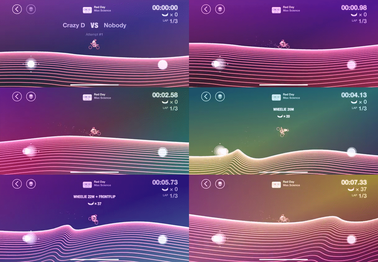
'Sand Dunes' new technical level in Rad TrailsSmaller changes
- Added tags to the leaderboard lists that highlights races that has not yet been defeated by anyone.
- The next unlockable race track is now highlighted in a more prominent way on the race track selection map.
- Added date tagging for messages.
- You now can get a message when a race is beaten by a new player.
I can’t remember any more specific changes but there is plenty of minor improvements.